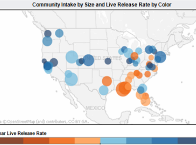
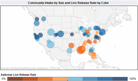
Here at <a href="http://www.earthware.co.uk" target="_blank">Earthware</a>, we have recently been working on a number of projects showing quite complex and multi-faceted data sets using consumer APIs such as <a href="http://www.earthware.co.uk/what-we-do/bespoke-mapping-implementations/google-maps.aspx" target="_blank">Google Maps</a> and <a href="http://www.earthware.co.uk/what-we-do/bespoke-mapping-implementations/microsoft-bing-maps.aspx" target="_blank">Bing Maps</a>. This has led us to explore lots of different ways of displaying more than one thing at a time on a map: We have looked at pie charts, shading, doughnuts (or donuts to our trans-Atlantic cousins). But, I keep returning to the view that;
- <em>Maps are never going to replace Excel</em> – when you get more than two numerical parameters that you want to look at at the same time then it is almost certainly better to use a table or at least a different type of graphic.
<a href="http://www.google.co.uk/imgres?q=where%27s+stig+images&hl=en&sa=X&nord=1&biw=1333&bih=679&tbm=isch&prmd=imvns&tbnid=COFN8hqAaoE0EM:&imgrefurl=http://www.thesun.co.uk/sol/homepage/features/2614721/Can-you-find-Stig-in-our-picture.html&docid=jhQDrFPC-Kcn3M&imgurl=http://img.thesun.co.uk/multimedia/archive/00878/28-08-2009-682_878401j.jpg&w=800&h=565&ei=g6-mTsH0D8O38QOnysWuDw&zoom=1&iact=hc&vpx=187&vpy=155&dur=14266&hovh=189&hovw=267&tx=163&ty=95&sig=111245553487391152847&page=1&tbnh=145&tbnw=203&start=0&ndsp=16&ved=1t:429,r:0,s:03" target="_blank"><img style="display: block; float: none; margin-left: auto; margin-right: auto;" src="http://img.thesun.co.uk/multimedia/archive/00878/28-08-2009-682_878401j.jpg" alt="" width="304" height="215" /></a>
<span style="color: #000000;"> </span>
<span style="color: #000000;">3</span>. <em>Just because you’ve got the data in a database, it doesn’t mean you automatically put it on the map</em> – so often we see websites and maps that are designed around the needs of the owner “I want to get as much of my stuff out there as I can!” and not the needs of the user “I want to see only the thing or things that most interest me in the quickest and easiest way that I will understand”.
<a href="http://www.maddiesfund.org/Images/About Us/Press Releases/Comparative Database Map.png" target="_blank"><img style="display: block; float: none; margin-left: auto; margin-right: auto;" src="http://www.maddiesfund.org/Images/About%20Us/Press%20Releases/Comparative%20Database%20Map.png" alt="" /></a>
Anyway, I recently read an article by <a href="http://www.ericson.net/content/2011/10/when-maps-shouldnt-be-maps/" target="_blank">Matthew Erikson</a> who I think really made my points for me in a very detailed way and so I thought I would point you in the direction of his article.
Neil